MAGIZINES
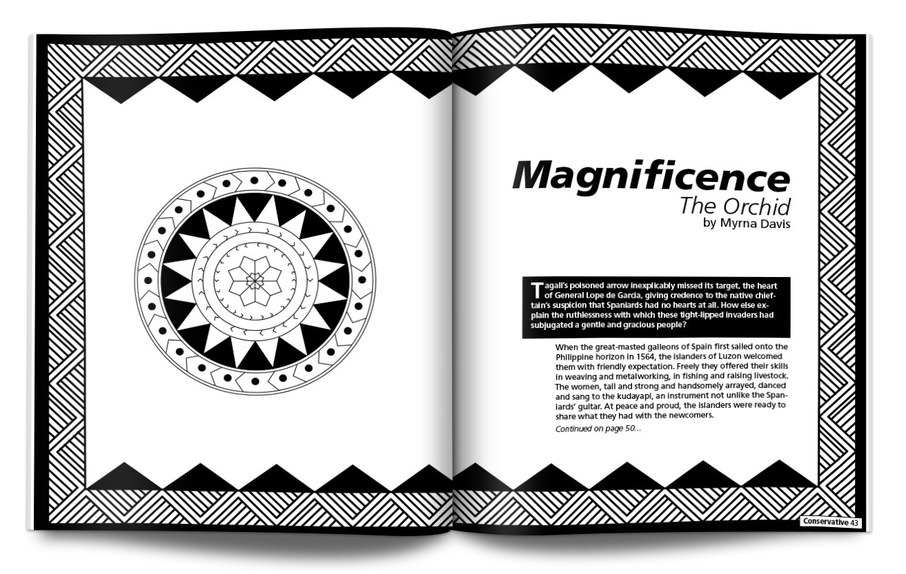
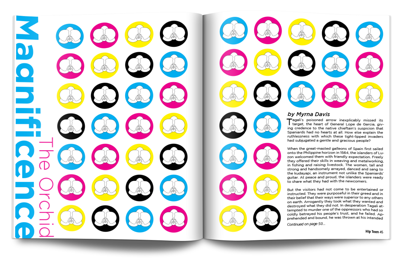
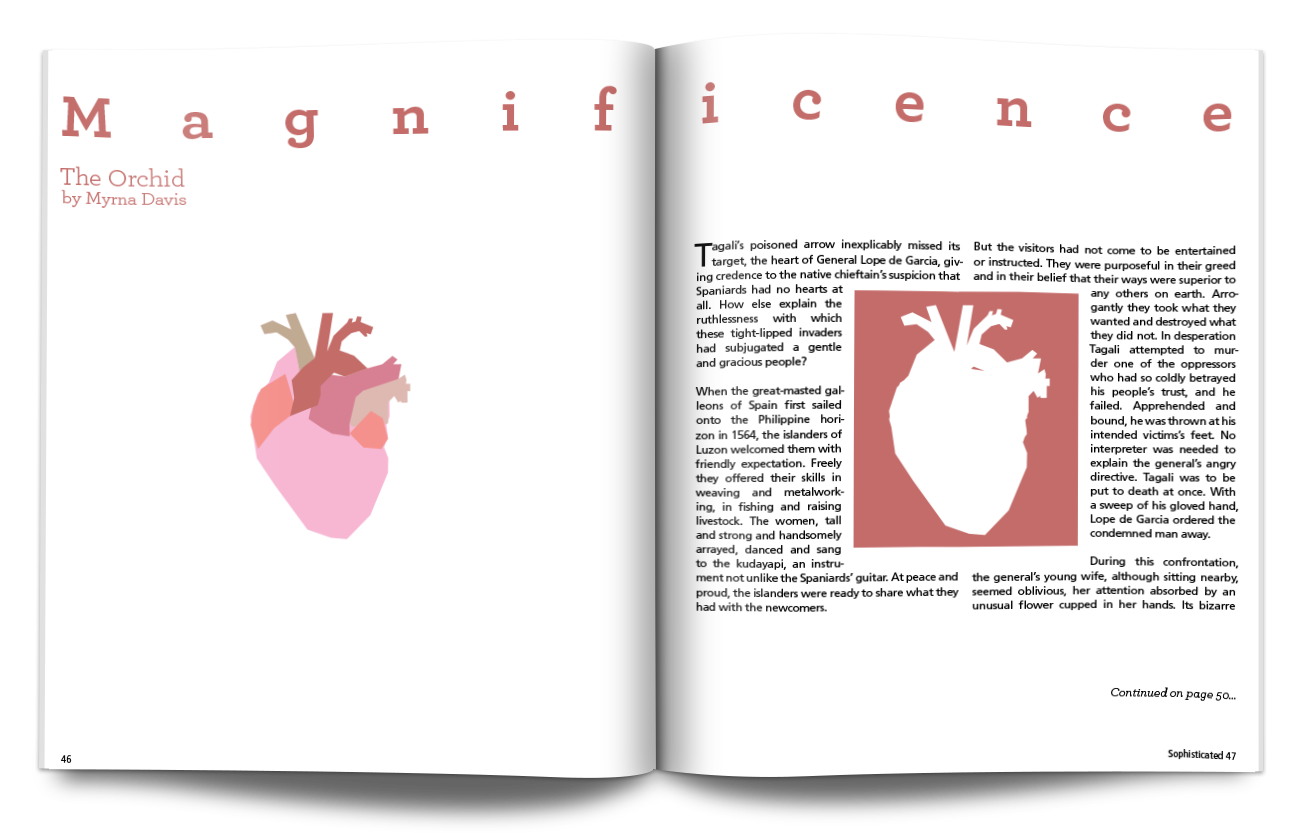
PAGE LAYOUT
This project we were challenged with reading a short story and fitting it into a magazine spread. We were to design the first spread of the story and then make one for a conservative audience, teen audience, and a sophisticated audience. I used patterns and little colors in the conservative one to make it more appealing to older folks and others that fall into that category. On the hip teen one i used illustration and a bright color pattern to really catch the reader's attention. The sophisticated one I used a lot of negative space and illustrations to really get the reader to look a bit closer at the design of the spread.
